For the final website, I decided on the name way early on. After knowing what would be the purpose of the website the name “Inner Peace” kept coming to my head and after thinking about other options, I came to the conclusion that there was no better name than that one. Inner Peace means peace from within which, taking into account the theme I settled on, – mental health for university students – it seemed to be the perfect title for the website. Therefore, that was the name I chose.
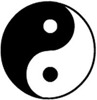
Now, when it comes to logo, I wanted it to reflect peace in some way or another. I began by looking at the yin and yang symbol, which represents balance.
I then thought about calming flowers or scents, camomile and lavender came to mind. I decided to go with lavender stems since it was simpler to not only draw but also matched with the colours I had in mind.
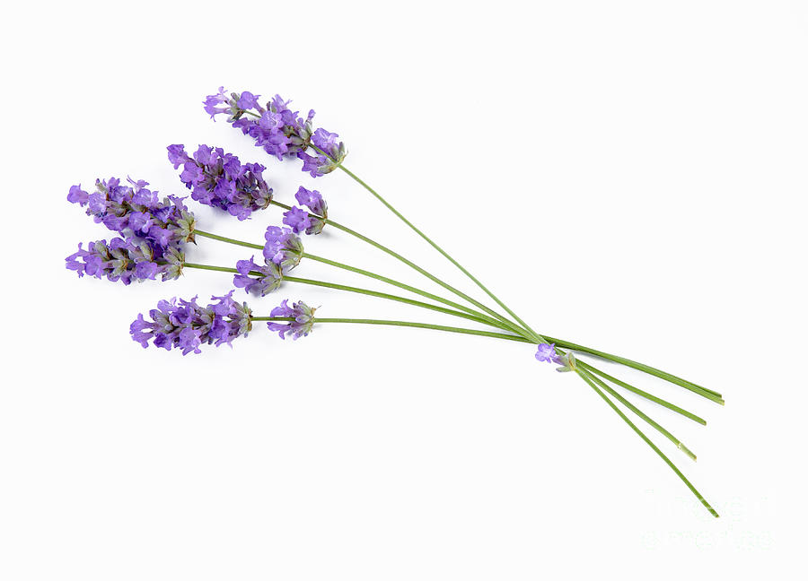
Lastly, I considered a colour palette. I knew I did not want to make the colours too bold since bold does not represent calm. I ended up choosing a few variations of pastel purple, which is a colour known for its tranquillity. Furthermore, purple has a special meaning to me and I thought it was only fitting to use it. Thus how the logo was born.
