On this nineteen page spread, I provide all of the market research I did to start my website. This includes, visual research, contextual research and my target audience.


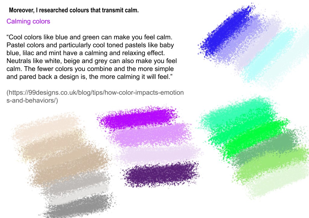
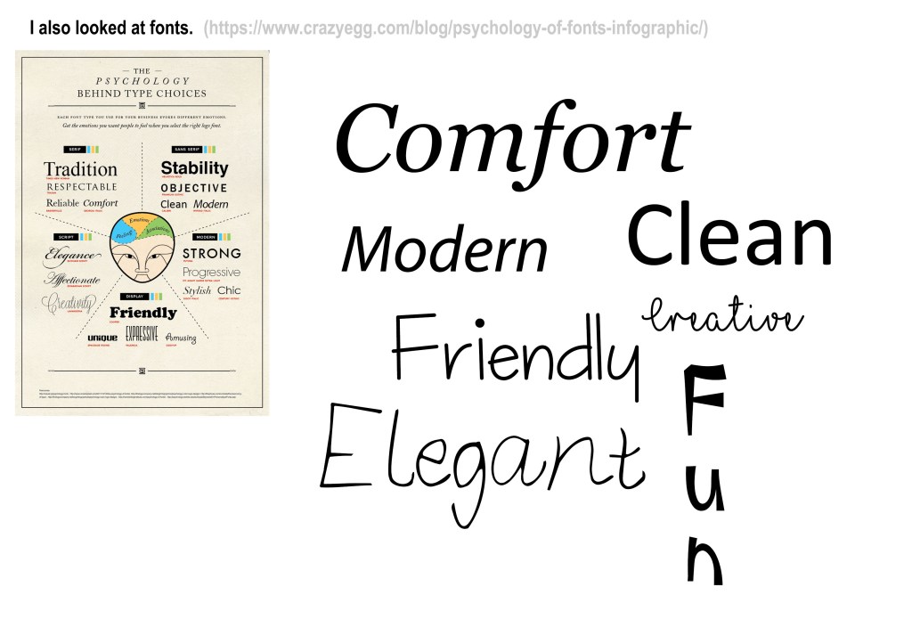


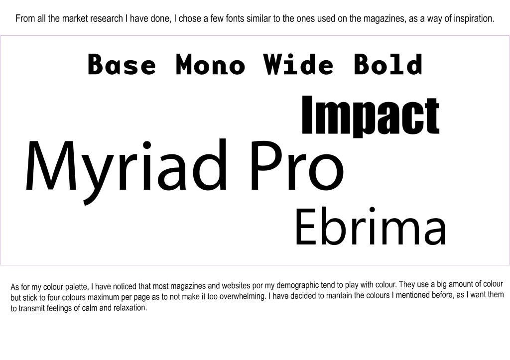
Althought I do not explicitly state it on the market research spread, I came to the conclusion that for my target audience (18-30, mainly feminine, university students), it would be best to produce a simple and clear website with the use of bold colours (these must all work together nicely), san-serif typography along with some bold images. I made this my final decision after looking at all sorts of different well-known websites and/or magazines with a similar target audience to mine. This seemed to be the logical thing to do.
